Fortnite: User Interface Refresh + Style Guide
Brief
Redesign contentious Fortnite UI assets/screens by merging the older, nostalgic UI with the current, modern style of UI


User Research
User feedback was collected through Reddit threads and informal player surveys during prominent UI update days to determine what screens/issues to focus on redesigning. Common issues included cluttered layouts, reduced customization, and unclear navigation.
Concept Development
Two visual directions formed: one emphasizing sharp, nostalgic designs, and one focusing on softer, modern designs. After multiple testing rounds, a hybrid approach was the solution — a merge of nostalgic structure with modern readability.


Visual
Direction
One
Visual
Direction
Two
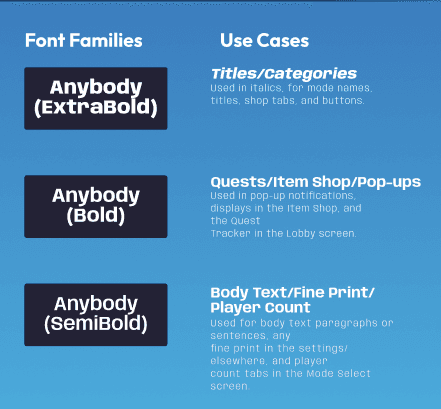
Style Guide
A comprehensive style guide was created for further consistency. Style guide includes typeface usage, color systems, icon/button sets, and image usage preferences.
Final mockups introduced improved spacing, consistent iconography, and more refined layout logic. A heuristic evaluation was performed as well across all screens.
Brief
Redesign contentious Fortnite UI assets/screens by merging the older, nostalgic UI with the current, modern style of UI
User Research
User feedback was collected through Reddit threads and informal player surveys during prominent UI update days to determine what screens/issues to focus on redesigning. Common issues included cluttered layouts, reduced customization, and unclear navigation.
Concept Development
Two visual directions formed: one emphasizing sharp, nostalgic designs, and one focusing on softer, modern designs. After multiple testing rounds, a hybrid approach was the solution — a merge of nostalgic structure with modern readability.
Style Guide
A comprehensive style guide was created for further consistency. Style guide includes typeface usage, color systems, icon/button sets, and image usage preferences.
Final mockups introduced improved spacing, consistent iconography, and more refined layout logic. A heuristic evaluation was performed as well across all screens.